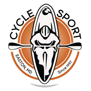
 Easton Cycle and Sport came to us with suggestions for updating their brand for a future marketing push. We ran in a number of directions, but good ones, with pencil sketched drafts to see what resonated with them and looked the best across all the different mediums they would be advertising on. After dwindling down the options, a general design for the logo was selected and digitized into black and white. It’s important that the design stands on its own, in its simplest of forms, before adding color, where things get emotional and subjective.
From there, a number of iterations, font treatments, color schemes, and friendly arguments amongst the design team ensued. After the majority is smiling and happy on our team, we made our recommendations to the client and made sure they were happy. And they are! Subtle, yet very cool… Do you see it?
This stuff is a labor of love for us. We genuinely want to be a part of our client’s successes, and we work with them more like partners than clients for that very reason.
Look for a new website and other focused marketing efforts coming soon from Easton Cycle and Sport.